I thought perhaps some of you would like to see some examples of the design boards I have been doing up. Colour consultations have been few and far between, with more and more clients requesting design consultations. This is exciting because I get to put the whole look together, rather than just a part of the puzzle. Many of my clients this fall have had dramatically different taste, and that is what keeps me challenged and loving this job!
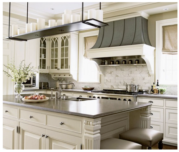
Let's begin with the Elegant Club House Client. This client's home backs onto a golf course, and she would like to combine her love of the outdoors and neutrals to create a country club feel within her great room and kitchen. This home was built in the seventies, and has great soaring ceilings and a large brick fireplace which need to be left as is. The walls, kitchen cabinetry and built-in's will be painted, and the countertops, furniture and lighting replaced. The ECH Client requested a space that was up-to-date but had a timeless appeal, with a soothing atmosphere. She liked the idea of grey, and had just purchased a white and black ottoman that she loved.
Many rooms like this were considered...
These were on the right track, now the space must be fully considered before deciding on a personalized colour and design plan...
The pale grey-white brick of the fireplace meant grey was already part of our scheme, which works against the warmth of the hardwood floors and the sun from south-facing windows.
So we had it:
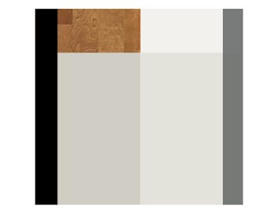
Steel grey upholstery balanced by warm grey paint on the walls and cabinetry, warm wood floors and furnishings. Black accents add some crucial contrast.
A television will be placed opposite the window of the great room, and so placement of the sofa under the window works well. A matching armchairs provides a cosy corner by the fire for relaxing and conversation, while two smaller armchairs provide additional seating and define the living area without blocking off the view to the fireplace.
The dining table is placed across the room, so that the dining views are the fireplace and into the kitchen beyond. Four chairs will serve for everyday meals, and two additional chairs for guests are tucked in alongside a small cabinet. This sideboard provides a place for display or to set up a bar/buffet for larger parties. It also grounds the dining table, making it part of a distinct area rather than just a table floating in the room.
In all pieces, clean lines are tempered by graceful curves and pattern is used sparingly to keep a restful atmosphere. The board below does not show many accessories, but the china that will be displayed inside my clients built-in's will offer plenty of eye candy on our focal wall.
The ECH fireplace is a bit of a conundrum (don't you just love that word?!)
It's asymmetrical placement in the fireplace facade had my Client baffled by how to decorate this area.
Once the built-in's a painted out in the pale grey we've chosen, this will be even more obvious.
The client is considering adding a mantle, which isn't really necessary, and may even take away from the simplicity that makes this fireplace wall work.
I suggested two solutions:
One, place a pair of baskets like these beside the opening, stacked with logs, for balance,
and centre some art above.
Adding art above a fireplace where it may be subject to heat requires some care -
metal sculture is ideal here, and the organic forms of these pieces work well in this space.
The second option is simpler, and my favourite. Gather some tall branches into a glass vessel like the one shown below, and place them beside the hearth. This look doesn't require any additional accessories. I think this is a softer approach, and looks less "decorated". My client has decided to try this out before making any other decisions.
For the walls we've chosen Classic Gray, Benjamin Moore 1548, in the Ulti-Matte finish, which will minimize the textured walls. Nimbus, Benjamin Moore 1465, will be GORGEOUS on the cabinetry in the kitchen and built-ins. Happy to say the client has tried these out and loves them :) In the kitchen , I've suggested a dark countertop, perhaps soapstone or honed marble, to draw the eye around the room and create the illusion of space. My client has said this may be a challenge for her - she usually goes for "safe" neutrals, but likes the idea more each day.
And that, dear lovelies, is the Elegant Club House I've been working on in a nutshell.
Would you like to hear about the Rock & Roll Baroque Home? How about a working to create Feng Shui Harmony in a builder home?
I'll post about those soon, promise - 'til then - a big MWAH, miss you all - x


0 comments:
Post a Comment