Before we dive into this post, I'd just like to say that the absolute best way to choose
color for your space is to have a professional come in and help you.
Every space is different, and each one requires careful consideration to achieve the best finished result.
That said, since grey is poised to take over for beige as the most commonly requested color from clients,
I thought a post about grey was in order.

First, I don't always recommend grey as a wall color.
If you have a north-facing space with little or no natural light,
it would be better to bring grey in as an accent.
You can read why at my post about how the natural light in your space faces affects color choices.
The best greys usually don't appear quite as appealing on a color chip.
People tend to go directly to the flat, cool greys, and there are many more subtle and suitable choices.
I will show you some of my favourite picks at the end of the post.
When choosing grey the two important considerations are the undertones that it contains
and the lightness/darkness of the shade.
Grey contains one of three undertones - purple, green or blue.
Green based blues generally appear the most neutral,
and I recommend them frequently because they are easy to live with
and complement a wide range of wood tones and other colors.


Blue based greys are the coolest, and most people go to these first.
To prevent the room from becoming too cold,
add warmth through natural woods, warm metals, additional (warm!) colors, etc..

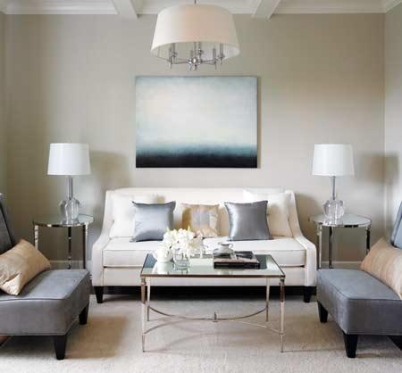
Now, look at blue grey without the all the warm additions from above.
It may not be for everyone, but the restful quality of cool grey is quite evident in this living room, isn't it?

Cool grey, camel, warm white and black - this is my personal favourite.
It's the color palette in my family room, which is not quite photo ready but I will share when it is :)
![[kitchen mick de giulio[1].jpg]](https://blogger.googleusercontent.com/img/b/R29vZ2xl/AVvXsEjMl1PScx-6wuuMc4B04T2T0ToO7OQKKYiOd9gzGdTW-UannpsgbjvcZc2TpTtkXslZ7T2vsvnk5wxg1vXgjZ2mhWPyZEybqvbItlAOGAu2i7EcOl1JqHcx4QsOjpOCgutg35lw-Qc5KE1K/s1600/kitchen+mick+de+giulio%5B1%5D.jpg)
Purple based greys are the ones I use the least.
The majority of my clients are working with some existing furnishings and finishes.
Most woods contain orange or red tones, and they clash with the purple.
Note the backsplash - do you think it has the same undertone as the cabinetry?

A dark purple-based grey coverlet is used here perfectly -
framed by cool white walls and ebonized floors,
warmed by a hit of yellow tones in the table and art..

This is a medley of different greys - but it works because of that one silver stripe in the wall treatment.

The most common way to classify grey is by cool and warm.
Cool greys work best in a room that receives direct sunlight during the period you will be using it.
This kitchen is definitely receiving cool light,
and will require a lot of those wood tones to soften the effect elsewhere in the room.

The orange tones provide great visual interest here, easily defining the bed as the focal point.

Dark, cool grey - without any warm tones to balance it.
It's dramatic - but could you live in this space?

Light cool greys are more forgiving.
This bathroom has an almost eretheal quality about it, grounded nicely by the dark ottoman.
![[mb+mableyhandler.jpg]](https://blogger.googleusercontent.com/img/b/R29vZ2xl/AVvXsEgVasLsgbQC8dSeQtgaA3_JN2JG_DxxB0VvgyOL9r-VDq26s1xP5_F7-VDV-KHh5rFervdfpfzb7ZXwvzrF0uNCRaUqKVjv0vBPCnw3eFgI9EWqoA39aFyqwdEZGiH3ND7cEgCNqJoK7EdU/s1600/mb+mableyhandler.jpg)
Warm greys are quite liveable.
These are the paints that I often steer clients toward who are moving uncertainly
from warm walls for the first time.
On the colour chips, these may not appear to be particularly attractive choices,
but once you see them on the wall - magic!

Moleskin. Almost brown, but still grey. A very warm and enveloping color.

Would you have thought that grey could warm up white?
![[Picture+5.png]](https://blogger.googleusercontent.com/img/b/R29vZ2xl/AVvXsEhw8nBcIh48ZC4cVPTV8Az-ubX7szFfeWdwyb65e3b6thmu7ZDKZvZvdT3aUhwKgOHJf5Rty6UTPt6NkvWVNnN72WneNZDKh2nehsGJOIHR_YXM1tUI2kyW7om4I4jfnRQpAAvHSbhVDTw/s1600/Picture+5.png)
Warm grey and warm white effortlessly mixies with black -
this space is unconventional, but oh so beautiful.
*Three matching carpets side-by-side - what do you think of that as a flooring solution for large spaces?
![[Picture+4.png]](https://blogger.googleusercontent.com/img/b/R29vZ2xl/AVvXsEiQ-fBrkoeYL0dyRHMYVek7xQCnt_PoT-Ho9leBrxX5tmItYOBidvrU8Ng-Ep1PAdt93DWzDmD314-DXFP6Np1juz8xyfQKqZBaKXXaeKlyBbIuKo6pnfR1b6LzbZXqQHBqBfem5By-zGE/s1600/Picture+4.png)
![[Picture+2.png]](https://blogger.googleusercontent.com/img/b/R29vZ2xl/AVvXsEj3-HDlUF_Dt8SvqA7fq9wlFKze1m3grx0ap4RtMGnKlC_hyphenhyphen7UlgCRbxPe-WSWJkj35Ku7SJ03O1XffyZZqZUKXCsFRNV8DgpDAM4GKhWMU0JoeOxOGBV0rQoDpuDDBxeAmFpJXyccqcAE/s1600/Picture+2.png)
I have a few BM favourites..
Coastal Fog - a soft warm grey.

Pearl Gray - a light cool blue grey.

Winds Breath - a lovely "griege"

and for outdoors, Behr's paint and primer in one can't be beat.
I used Intellectual on my own railing and banisters, it's a beautiful dark warm grey.

The interior of my home was painted almost entirely in a dark steel grey when we moved here.
With dark, blue-based grey ceramic tile and ebonized hardwood floors, it was just too cold for me.
I have been moving through the house, repainting room-by-room.
Grey remains as an accent in our entry, family room and kitchen.
Have any of you embraced grey? Are you considering it?
I'd love to hear which greys you have used, and if you are enjoying them.
til next time..
0 comments:
Post a Comment